The top rule I learned in art school is that rules are meant to be broken — but you have to know the rules before you can break them.
This applies to all kinds of art. You’ll need to study form and function, the rule of thirds, light and shadow, proportions, rhythm and much more.
Once you know these principles, the techniques of using them, and why they work, then you can have fun playing in your studio. Coloring outside of the lines is encouraged, but you need to know where the lines are first.
These days, a lot of people are breaking the rules first and figuring them out later, which is honestly a good way to get more people to participate. Spending time and money drinking way too much coffee while toiling away in Berkeley or Annandale isn’t for every aspiring small business owner.
The old fashioned way has stood the test of time, but as the world shifts and changes faster than ever, we’ve learned to follow the facebook motto; move fast and break things.
Let’s face it, once the “For Dummies” series of how-to books were unleashed on the world, going the long way ‘round lost some of its appeal.
With that in mind here’s a crash course on how to use typography over your branding images.
What is typography?
Typography is the art and technique of arranging type to make written language legible, readable and appealing when displayed.
Why is typography important in graphic design?
When typography is done correctly, the layperson is pretty much oblivious to the process that made it so. It’s beautiful and it’s effective.
The importance of typography lies in avoiding disasters. Make sure you double-check and triple-check your work.
In the big design houses, whole teams of people are employed just to edit and proofread copy before it goes out the door. By the time consumers see it, dozens of sets of eyeballs have reviewed it. That’s also true of any photographs or illustrations that go with the text.
Typography is important to graphic design because it’s rare that the photography can tell the whole story on its own. Hugely famous brands can get away with it on occasion, but small businesses don’t have the brand recognition to pull it off.
Many times, words on graphics are used to tell the audience what the company wants the consumer to do. This is the call to action and every effective marketing piece has one. Phrases like “Book Your Trip Now” or “Come in to test drive the new model today!” give the consumer an actionable task to complete.
Other times the text includes important information and answers important questions — Who, What, When, Where, Why, and How. It fills in the details so your audience isn’t confused.
If they’re confused, you’ll have to cross your fingers that they’ll take it upon themselves to fill in the blanks. It’s better to give them the info they need in the first place; let the text do the work so they don’t have to.
What’s more important in design: images or text?
They’re equally important. Even though a picture tells a thousand words, an image without text doesn’t say enough about you, your product, your business or what your customers should be doing next. And a plain block of text has a very hard time capturing attention.
The imagery catches your attention, and the text makes the sale.
As you’re scrolling through Facebook, which text posts stick out? It’s the ones with the silly, colorful backgrounds, right? They’re a break from all the other posts and somehow feel more important, or at least deserve an extra second of your time to decipher.
Tips & Shortcuts
You don’t actually need an over-priced fine arts degree in order to be artistic. A little bit of know-how goes a long way these days, and this blog is meant to give you some timesavers and quick wins.
If you’ve already got your personal brand photography gallery in place, congratulations. You’re in good shape. Now all you need to do is choose a message, a font and a layout. There are lots of easy online tools that will assist you with it. (Canva is a very popular option.)
The first step is to choose your photo. Take your time to get a good one, don’t settle for one that has easily correctable issues. Never say to yourself, “Oh it’s fine, no one will notice.”
FACT: People will notice.
If you’re still in need of photographs, contact me and my team at Taylored Photo Memories so we can do a photo session for you. You’ll get the images you need AND guidance on how to use them.
Second, write your message. Some designers would tell you to pick your font and layout before you make the text fit the space, but if design and text are equally important then this step should really come second.
You want a message that’s short and punchy. Attention spans are getting shorter and every second counts. Get your point across quickly and with impact. Don’t waste any characters. But also don’t turn it into an unreadable Twitter post with excessive use of abbreviations and shorthand.
Now comes the fun artsy part — bringing the photo and the text together.
Make your copy stand out. The quick and easy way is to increase your font size or give your text a contrasting color. You can also add a shadow, echo or lift effect in Canva or your favorite graphic-making tool.
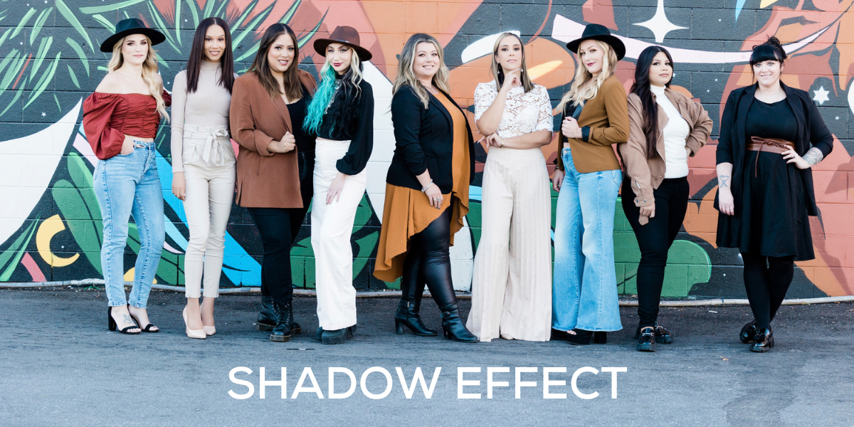
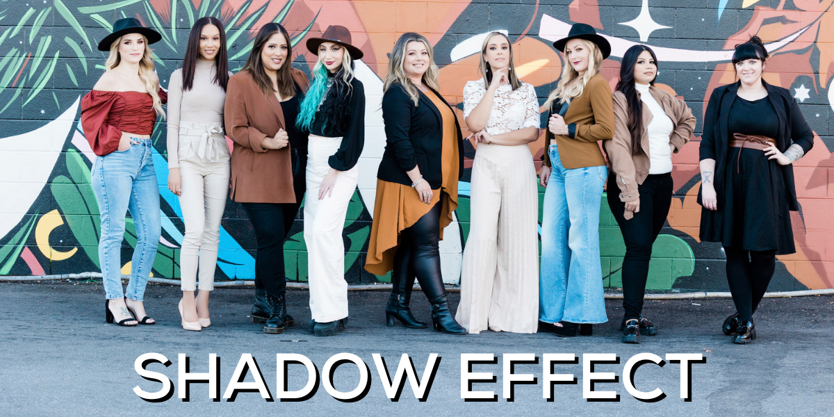
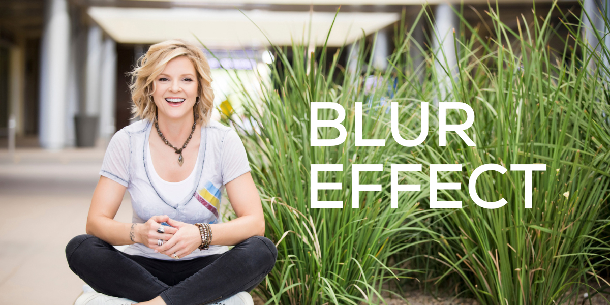
You can also try altering your images with a slight blur or maybe some transparency. If you’re using Canva or a similar software, after adding text to your picture, select your image and open the filter window. Then slowly move the blur slider to the right. You can preview your photo becoming blurrier in real time, and stop just as your text comes into clear view.

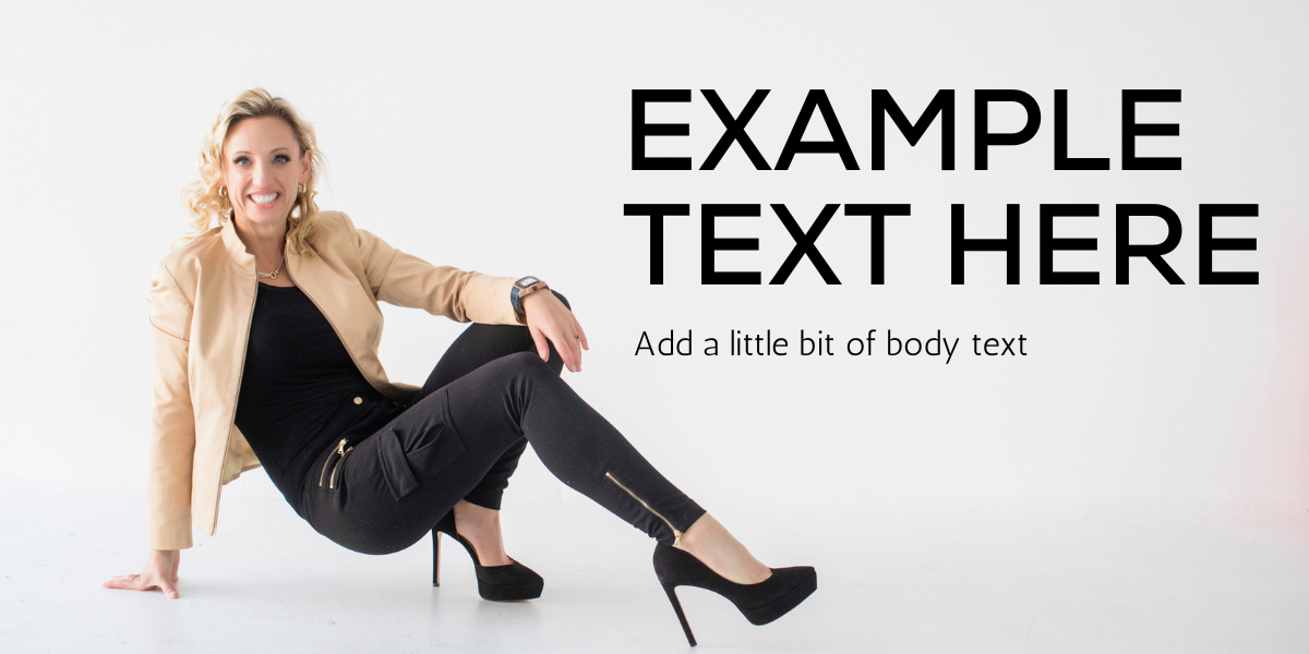
Another way to make good use of your brand photography is by adding text to an image’s negative space. Look for open skylines, large areas of repetition such as a brick wall, a cloudy sky, a forest of trees or even a block of color.
You can also ask your photographer to take some shots that intentionally give you room to work with. Check out some examples from some of my recent sessions.
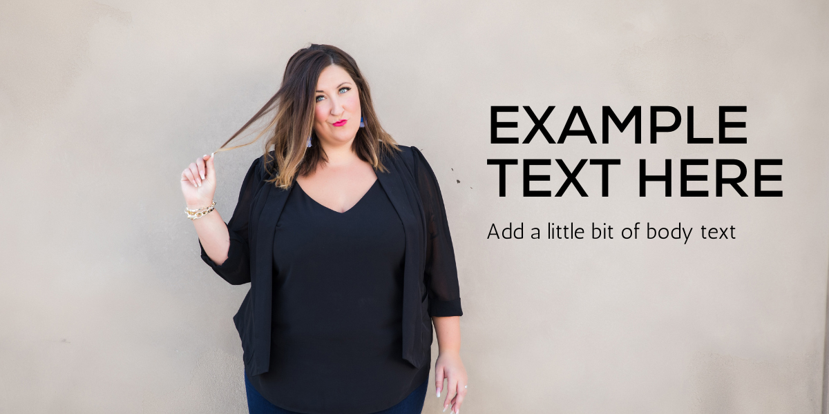
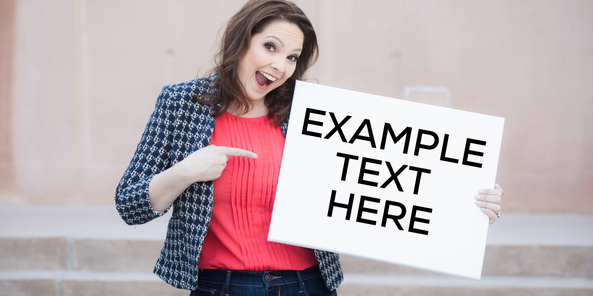
There are as many ways to make text on images look good as there are colors of the rainbow. Hopefully these few quick wins can set you on the right path. As Bob Ross always said, “We don’t make mistakes — we have happy accidents.” Every misstep is a learning process and presents a new way to solve a problem that might just make the whole picture better.
Putting text on images is just one way to define your brand and only a small step on your successful branding journey. For the complete roadmap, check out the Ultimate Brand Checklist.